Domus Textiles Case Study
Domus Textiles, a leading provider of high-end fabrics, approached us to redesign their outdated website. The primary goal was to create a modern, visually appealing online experience that reflects the quality of their products while addressing usability and accessibility issues. The previous site was difficult to navigate, had a cluttered design, and failed to showcase their textile collections effectively.
The details
My Role
User Interface Design
Deliverables
Figma prototype containing final ui design
The problem
Domus Textile's current site feels outdated and isn't able to attract customers in an industry all about looks as they wish to expand their business into the digital world.
The Solution
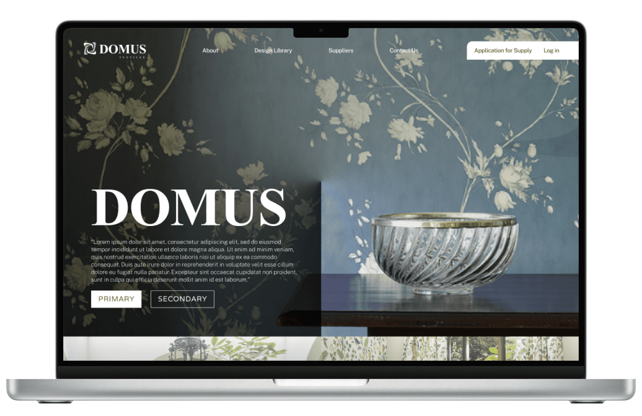
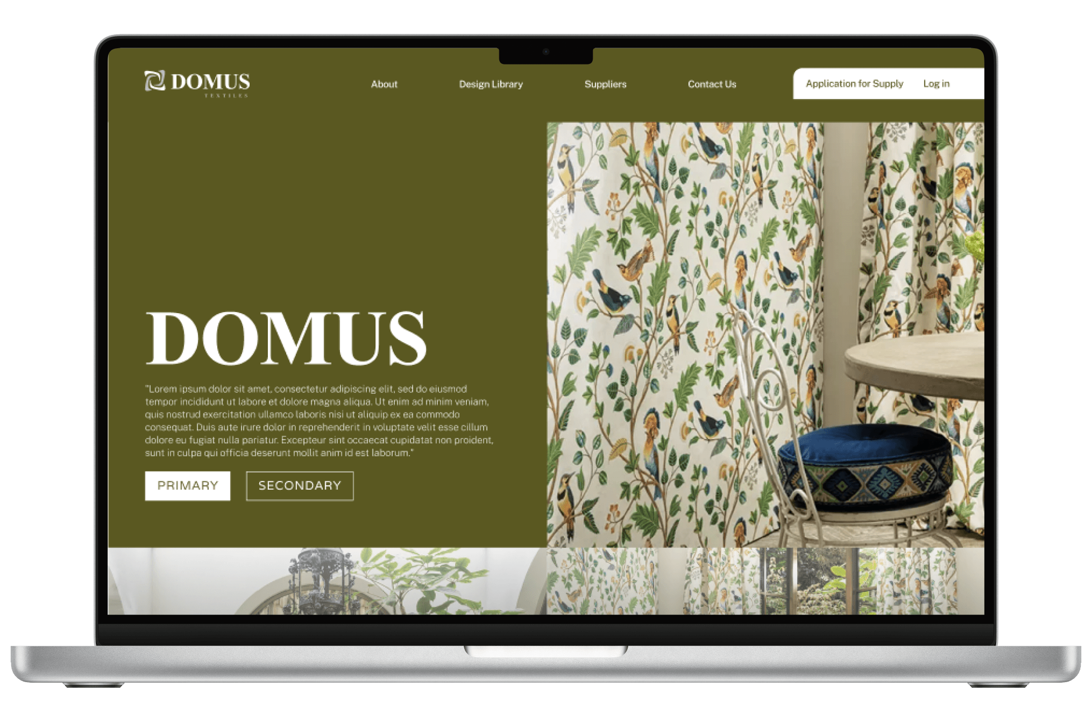
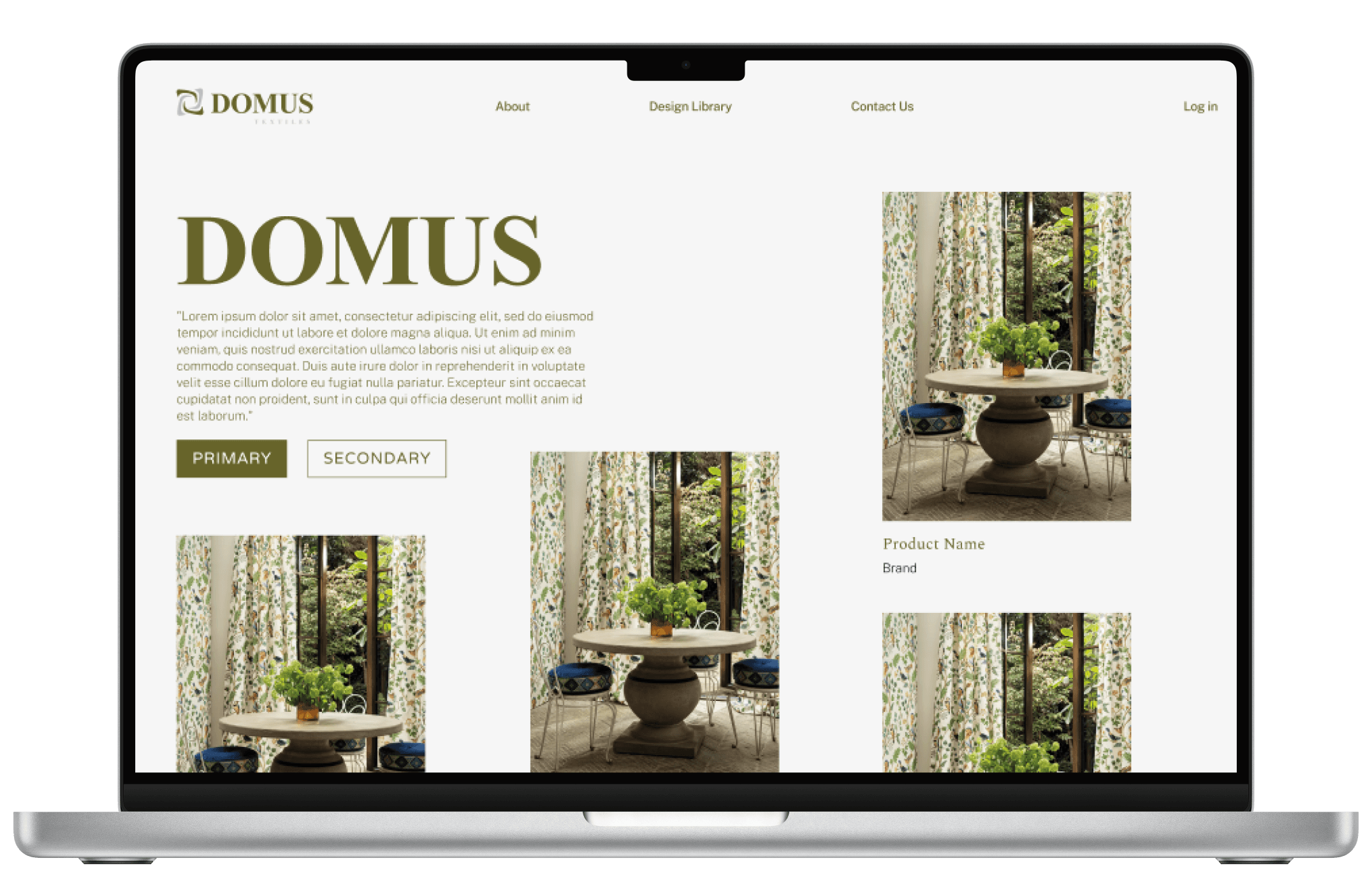
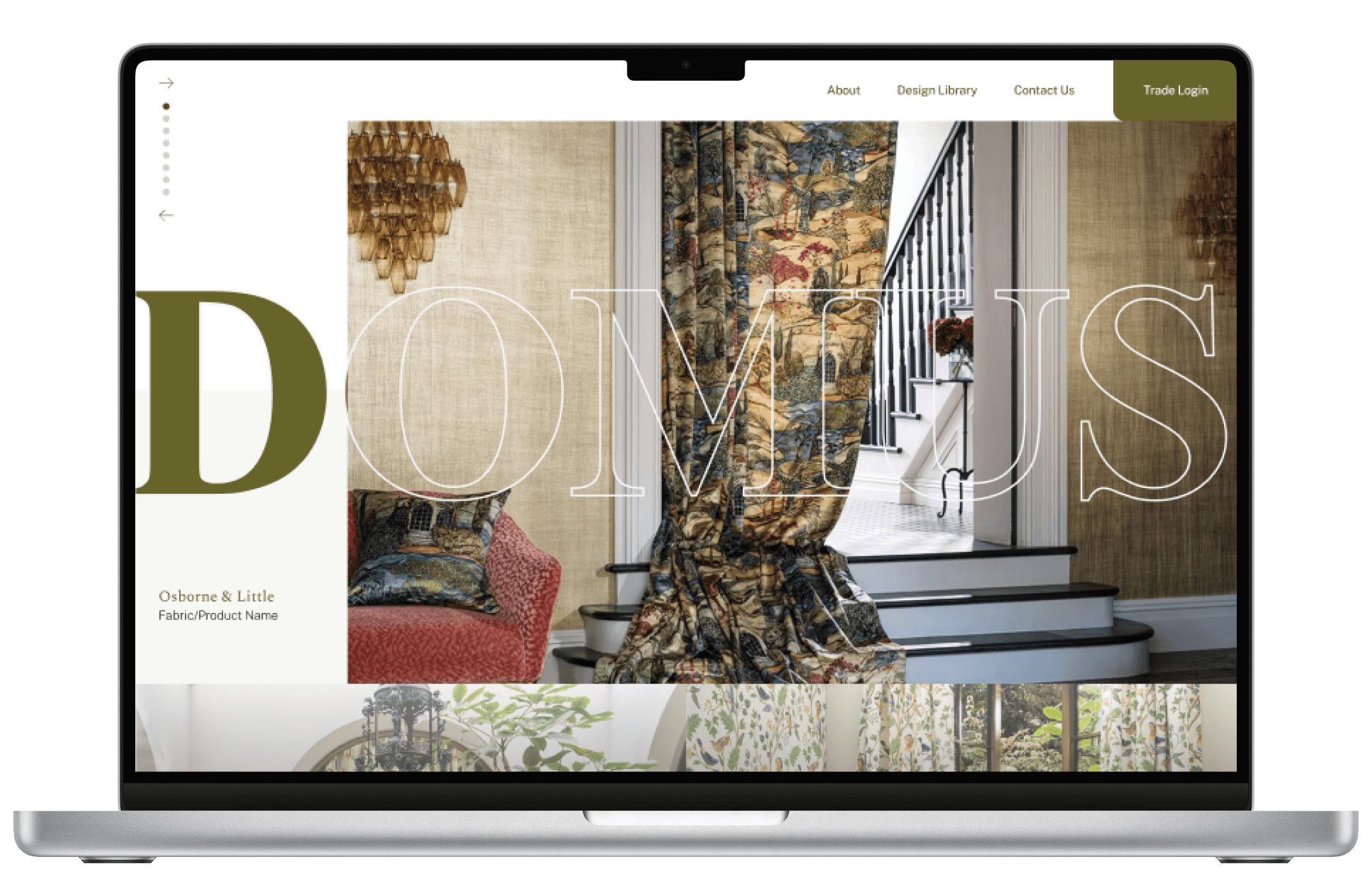
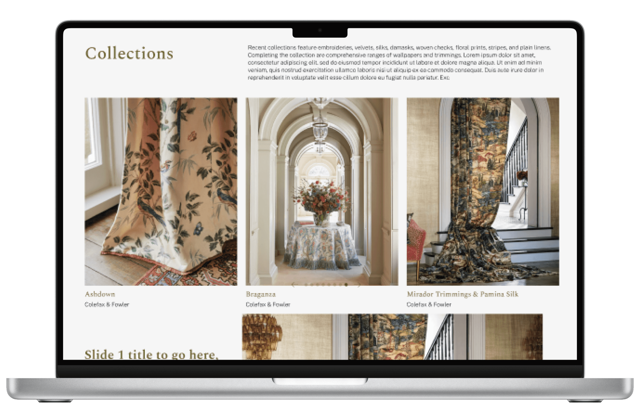
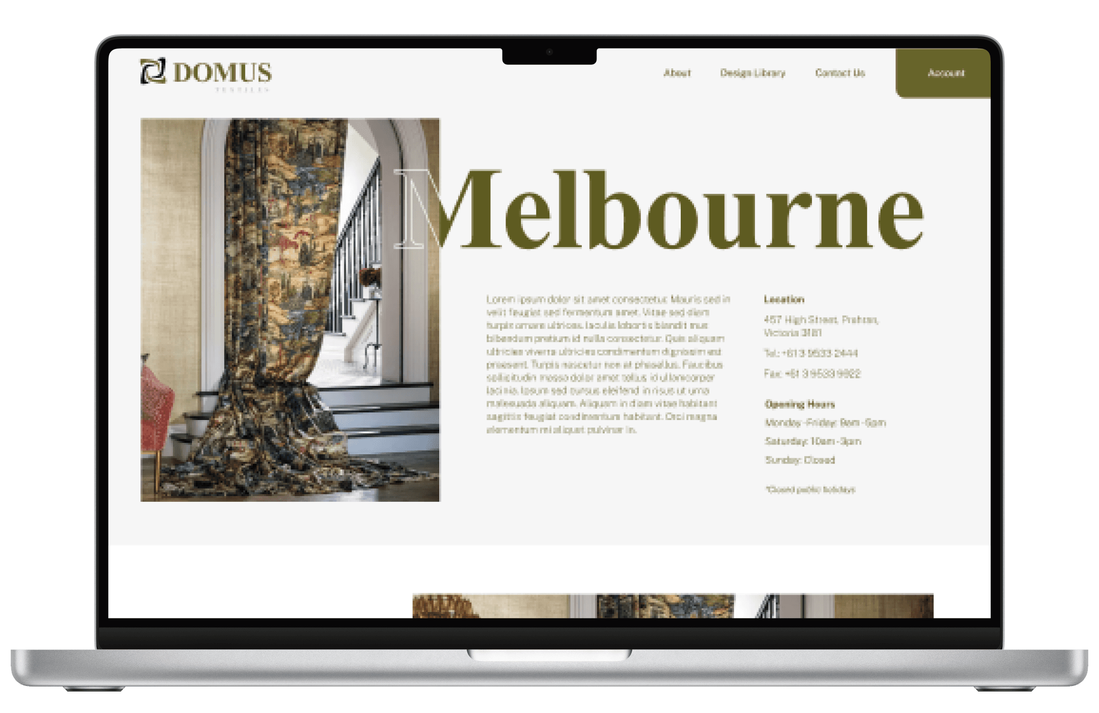
Create a magazine style website, showing off good quality imagery of textiles acquired from their suppliers in order to compete with the market.
What wasn’t working
The team at Domus Textiles felt their existing website was falling short. It had a few clear issues:
• The design looked old and outdated
• There was no clear path to the design library
• Pages were too text-heavy and lacked breathing room
• The overall layout felt boxy and uninspired

Where we started
For a brand like Domus, first impressions matter. With many customers discovering them online, the website needed to better reflect the quality and creativity behind their products. We kicked things off with discovery sessions and a detailed UX review to understand how people were using the site and where it was letting them down. From there, we pulled together moodboards to shape a visual direction that felt fresh, confident and aligned with their audience.

The Plan
We set out to create a modern, visually rich website that broke away from the generic look so common in the industry. The new design brings the product to the forefront, offering a more memorable and enjoyable experience that helps Domus stand out for all the right reasons.
Exploring ideas
With a clear direction in place, we began exploring layout ideas, interactive elements and visual treatments that would bring the new vision to life. We focused on:
• Creating a cleaner, image-led layout that showcased product textures and patterns
• Designing intuitive pathways to guide users to the design library
• Simplifying the content structure to let visuals do the talking
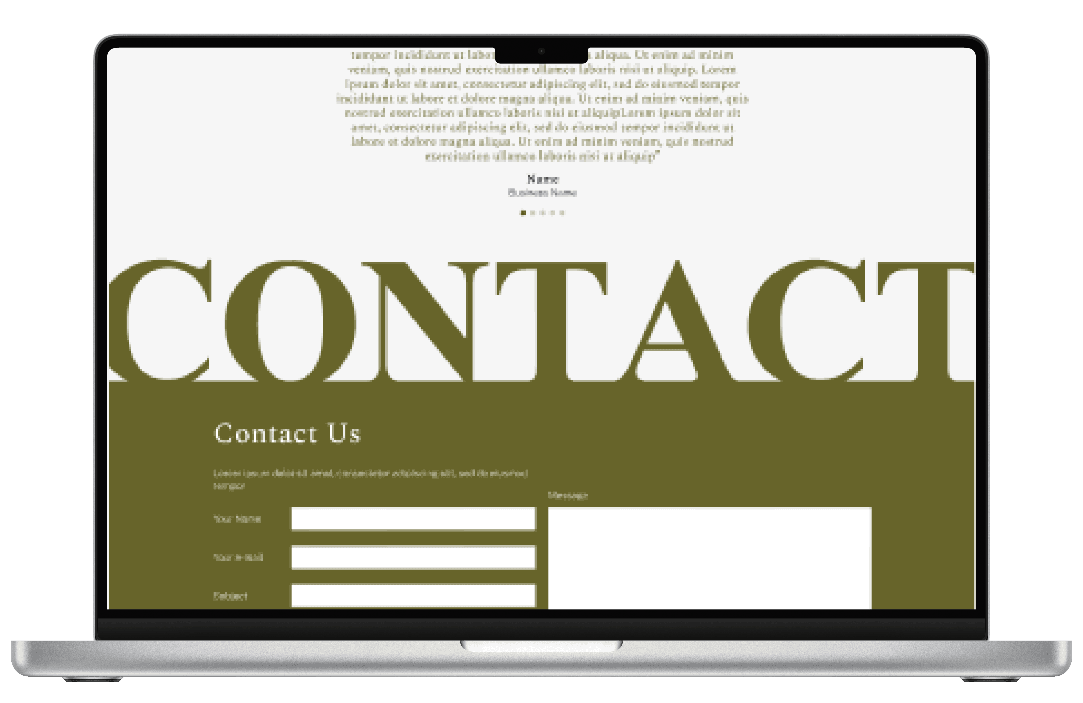
• Experimenting with whitespace and modern type to create a more elevated feel
This concept phase helped shape a strong foundation for what would become the final design.

The end result
After several rounds of feedback and refinement, we designed a clean, image-led site that feels intuitive and inspiring. It now speaks directly to design professionals and interior stylists, making it easier to browse, discover, and fall in love with the Domus range.
The Rundown
Success?
The Domus Textiles website was successfully transformed with a modern, visually engaging design. The new digital assets were carefully crafted to align with the brand and its audience, creating a captivating user experience that delivers the "wow" factor.
Challenges
The Domus brand had minimal restrictions, providing creative freedom while also presenting a challenge in finding the right design solution. Through multiple iterations and team feedback, we refined the design to achieve the perfect balance.
Check it out
Coming soon!
Overall
The project’s design was a success, delighting the client and giving Domus a competitive edge while effectively meeting the brief.
